Business Websites
Orvane — Private Office
A studio concept for a fictional family office: Swiss International Style pushed to the extreme, with a visible 12-column grid, one vermilion accent and generative figures drawn in code instead of photography.
Overview
Overview
The brief we set ourselves. How should a private office present itself if its whole promise is discretion? It has no products, no client names and no performance claims. Typography and order have to carry everything.
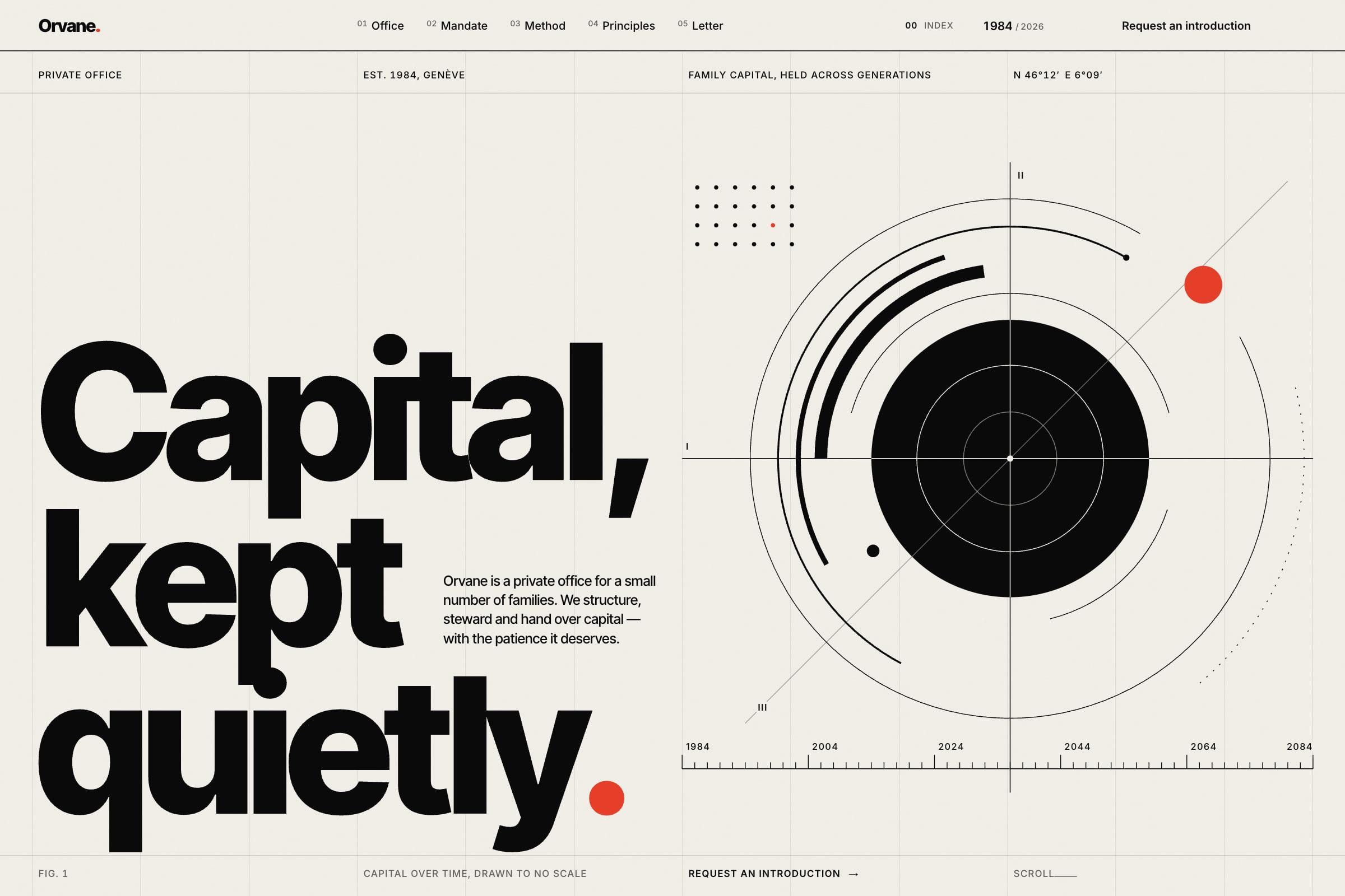
The design idea. We took Müller-Brockmann's Swiss grid literally. Twelve hairline columns stay visible across the page, and every label, heading and figure hangs off its column line. The hero is a typographic poster: 'Capital, kept quietly.' beside Fig. 1, a precision instrument of rings, rules and a ruler from 1984 to 2084. Fig. 2 is a poster of forty-two rings, one for each year since the office opened, and it is a working instrument: point at a ring, or use the arrow keys, and it reads out its year, with the handover years marked. The page also carries a band of six fictional partners with ring monograms, a signed excerpt of a quarterly letter beside a one-page statement, and a flat office fee on that statement that proves the transparent-fees principle.
Typography and colour. Inter Tight 800 for the hero and the big figures, Inter Tight 600 for section heads, Inter for text, tabular figures throughout. The palette is ivory paper with a faint print grain, true black and one vermilion. The vermilion takes over the page exactly once, in a full-bleed field that reads 'We keep our silence.'
Motion and technology. All imagery is SVG generated in JavaScript and animated with the Web Animations API. The header counter is a year odometer that rolls from 1984 to 2026 as you scroll. Key figures roll into place on digit strips. In the hero, the bezel rings turn at different rates, the vermilion orb leans toward the cursor with heavy inertia, and a crosshair gives the year and generation. Signatures are drawn stroke by stroke, and the page ends on the Fig. 1 ruler under the wordmark. Reduced-motion users get the finished state at once.
What a client can take from it. Wealth managers, law firms and advisory boutiques can see how restraint becomes a visual identity: no stock photography and no dashboards, just a rigorous grid, honest copy and drawings that work like instruments. This is a studio concept: Orvane, its partners and every figure in it are fictional.
Gallery
Inside the project
Fig. 2: one ring per year, 1985–2026. Point at a ring, or use the arrow keys, to read its year. Mobile: the hero, Fig. 2 and the principles, with the year odometer in the header. The mandate, with the ink hover row on Stewardship. Fig. 1 up close: the crosshair reads the year and generation, and the orb leans toward the cursor. The quarterly letter and its single page of figures, with the flat office fee on the statement. 'Introductions are made by letter': the form and the footer wordmark with the 1984–2084 ruler.